Every TicketSignup event automatically gets a free event website. But if you’re not a web designer, you may be asking: how do I make my event website look good?
Luckily, the default template for websites is clean and professional, so if you do nothing to your event website, it’s still going to be fully functional and easy for your ticket buyers to navigate. But if you have the time, customizing your event website is a fast and easy way to upgrade your online presence and create a fully custom experience.
Table of Contents
The Basics: How to Create Your Website
Your free event website is automatically created from the information you input in the Event Setup Wizard. On step 3 of the wizard, you can access your first customization options for your website:
- Banner Image: This is the header image on your homepage. As the most prominent thing visitors see, we recommend customizing this with a fully custom image (suggested size: 2400×800 pixels). However, if you don’t have a custom image, you can also pick one of the images from our “System Images” so the banner fits the event type.
- Logo: Upload a custom logo for the top left of your website. If you don’t pick a logo, a simple ticket icon will appear in that spot.
- Color Scheme: Pick from our custom color schemes. The default scheme shows first, but clicking “Explore More Color Schemes” and using the drop-down menu for types of color schemes will give you tons of options. If you have a specific brand color or full custom color scheme, you’ll be able to update that later.
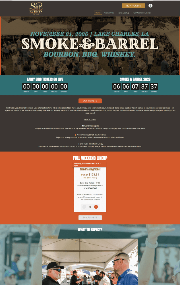
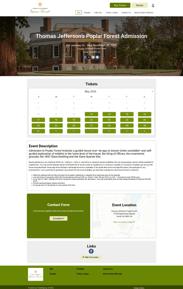
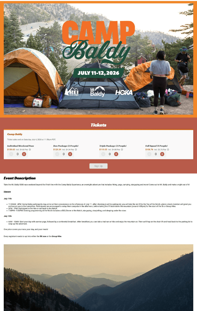
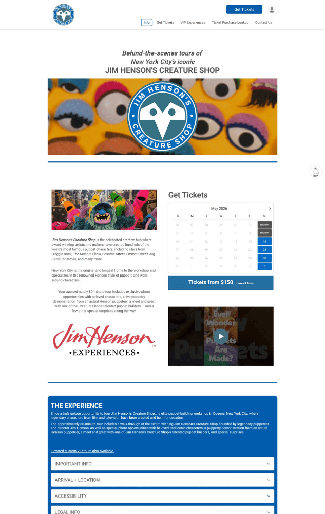
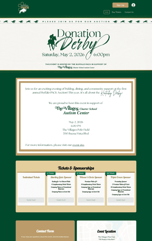
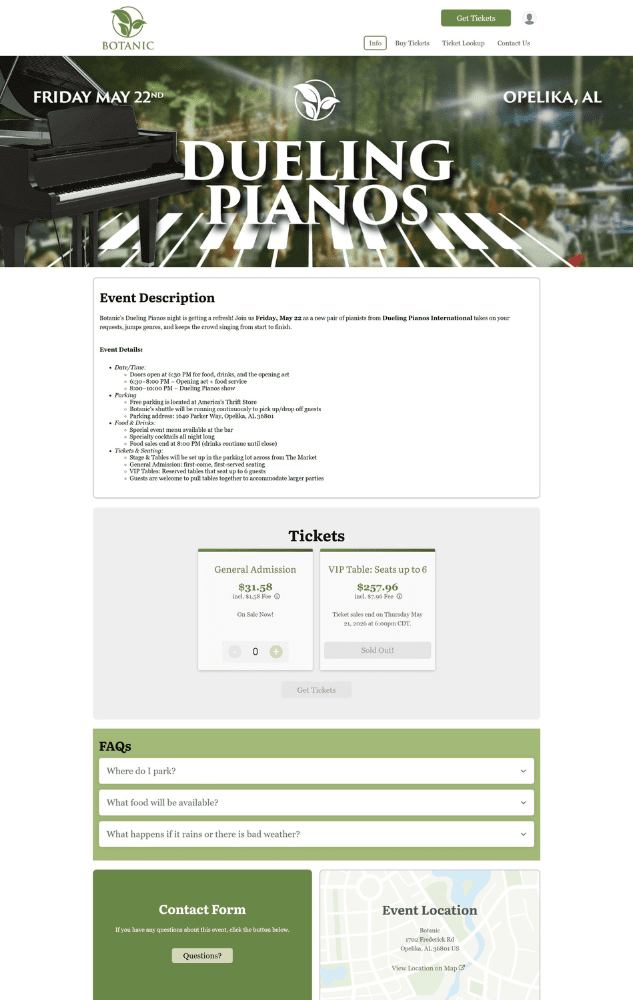
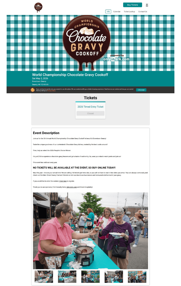
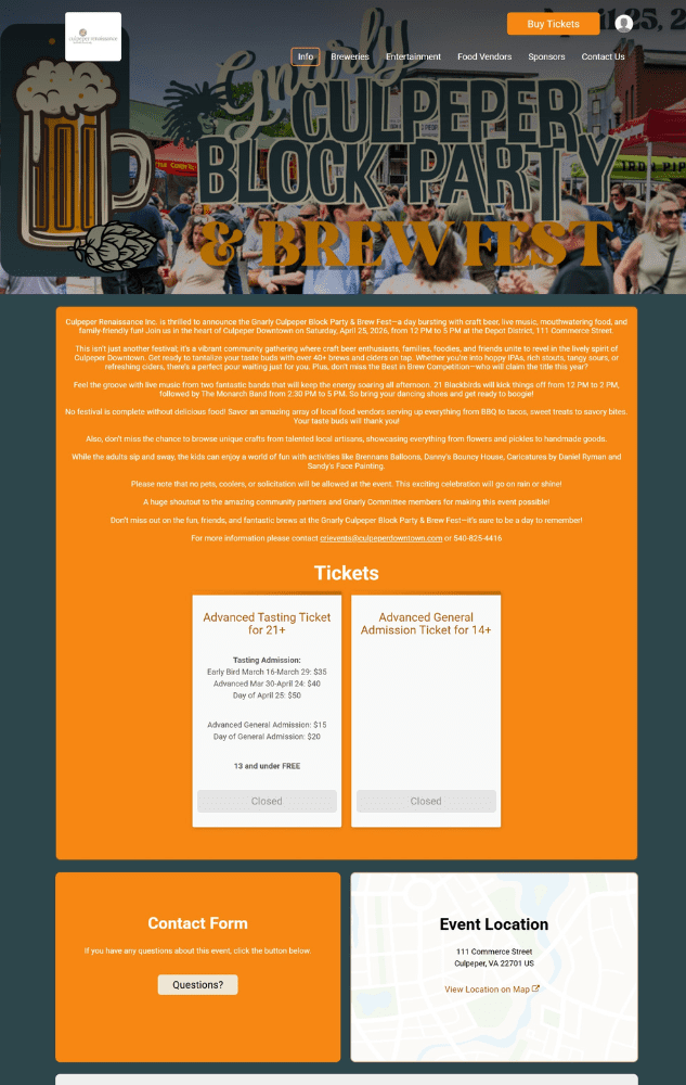
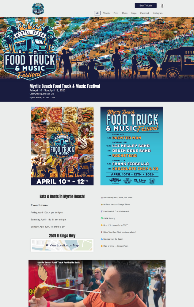
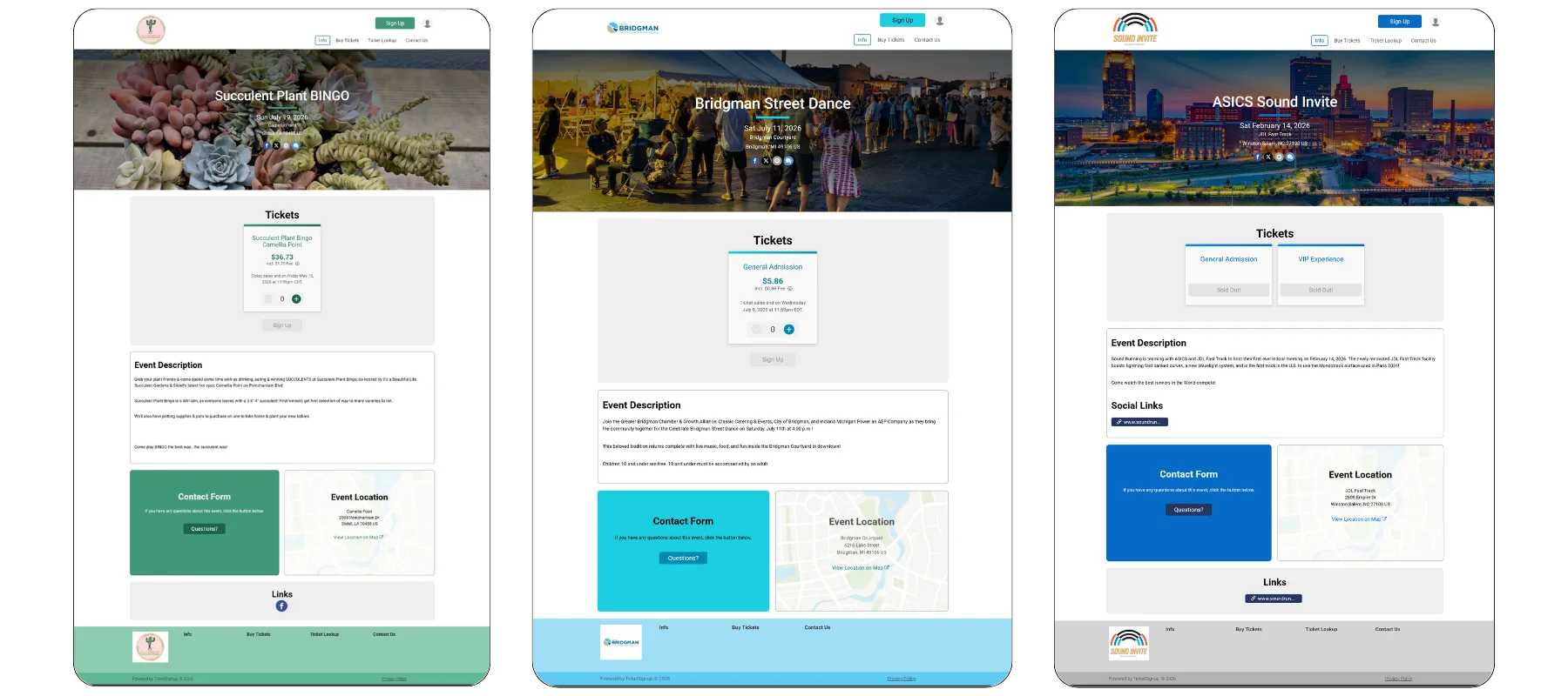
Examples of TicketSignup Event Websites Using the Default Template
Building Out Your Event Website
Once you complete the setup wizard, you’ll have the option to see your initial event website. Now, you can make updates to the event website and build out additional pages by navigating to Website >> Website Builder. For full details on using the TicketSignup Website Builder, check out our how-to.
Updating Your Branding
To update the branding you added in the wizard, or make more branding customizations, go to your Event Theme. You can access the Event Theme directly from your dashboard and from the menu in Website Builder. The Event Theme lets you set:
- Homepage Banner was set in the setup wizard. Here, you can pick a new image and try different layout options and content customizations.
- Page Banner is an option to customize the banner on all pages other than the homepage.
- Logo lets you change the logo for your website. Additionally, you can add a favicon (the little icon that shows in the browser) here.
- Social Media Links makes it easy to add links to your socials to your event website. Add any accounts you actively use here.
- Color Scheme allows you to re-set the color scheme you chose in the Event Website. To create a fully custom color scheme, click on the “Add a Color Scheme” button at the top of the page.
- Font Theme lets you to pick a custom set of fonts to use throughout your website.
- Website Footer enables you to customize the wording in the footer of all your pages.
Access Theme Options From Your Dashboard
Access Theme Options From Website Builder
Add Content To Your Homepage
TicketSignup has a few default components they show on the homepage to ensure your key details area available to potential attendees. But you can add additional components to create FOMO, clarify event details, and promote sharing the event. In addition to standard options for things like text, button, and image, TicketSignup has a wide array of pre-designed components to add to your website, including:
- Additional media options, like a YouTube Video, image group, slideshow, and playlists.
- Event details like a description (from the Wizard), location, and an FAQ.
- Data-driven components to drive demand, like a countdown clock and participant count.
- Cross-sell options with an event list
- Ticket Management options like Ticket Lookup
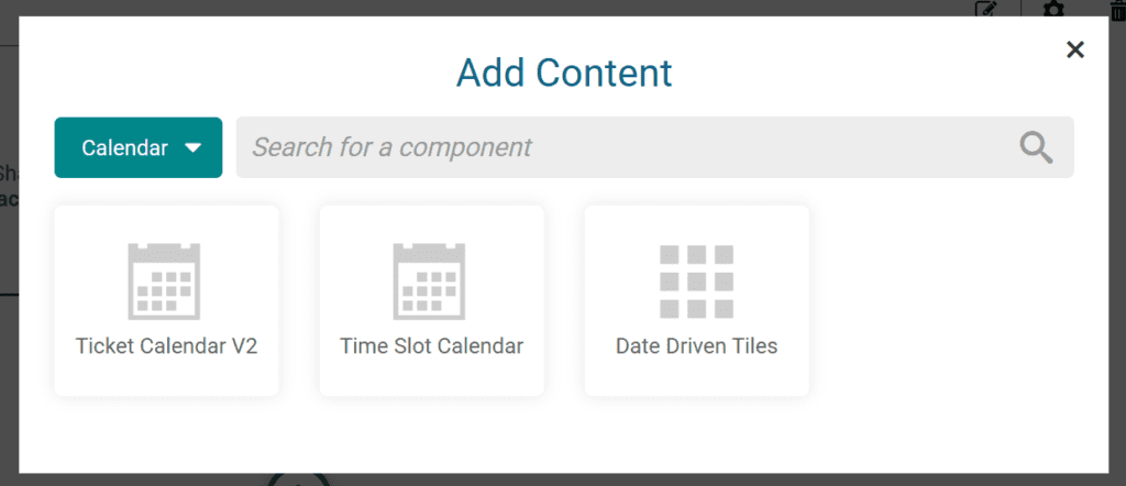
- Multiple calendar layouts for calendar-based multi-day events
Bonus: If you build an FAQ, you can also easily enable your own TicketSignup AI Chatbot to help manage customer support questions for you.
Add Additional Pages to Your Website
If you have a robust event with many pieces – like a festival with food vendors and a stage schedule – you may want more than one page to build out your content. Website Builder makes it easy for you to add menu items and pages to build out a complete event website.
7 Ways to Make Your Event Website Look Better
Websites are about function, but you also want them to look professional and appealing. Now that you’ve gotten your structure together, we have a few tips for improving the look of your website.
1. Be Consistent With Your Style Settings
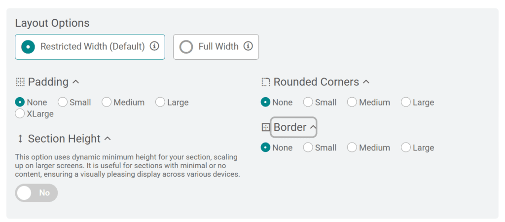
Every section on your website has layout options, including the width of content, padding, and (for restricted width components) options for borders and rounding corners. For the most part, you want to pick a style and stick to it. That means that if you select full-width, keep most of the page full-width. If you opt for restricted width with rounded corners and borders, make sure that the rounding and border are set to the same settings across the board.
Style Options for Your Sections
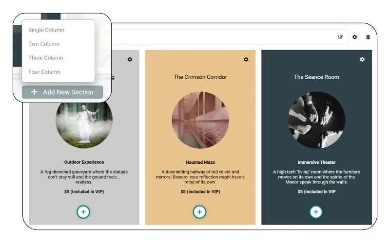
2. Mix Up Your Columns and Components
While too much switching of widths can be off-putting for websites, some visual differentiation helps keep eyes engaged. Include 1, 2, 3, and even 4 column sections to present your information (or images) in a more interesting way.
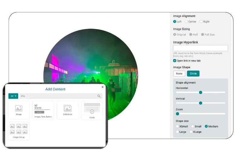
3. Incorporate More (and Different) Photos/Images
Photos bring your event to life. When possible, use photos throughout the website. If you don’t like how they look when you simply use the “Image” component, you have many more options.
- Using the image component, you can update the alignment and size of your image(s).
- Turn your rectangular image into a circle.
- Add a slideshow to feature multiple images together
- Use images as the background of components
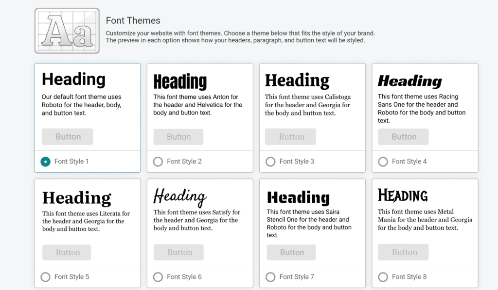
4. Customize Your Fonts
Fonts are a simple way to take the “template” look away from your website. Select from any of our custom font pairings to create an overall look that better matches your event.
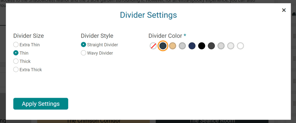
5. Create Separation
A full page of non-stop content can be overwhelming to your visitors. Create visual separation between sections on your website. This can be done in a few ways:
- Use colors (or greys) on some sections to divide them from other sections.
- Use a divider to create an automatic dividing line. Dividers are available either straight or wavy, in a range of thicknesses (and all your theme colors).
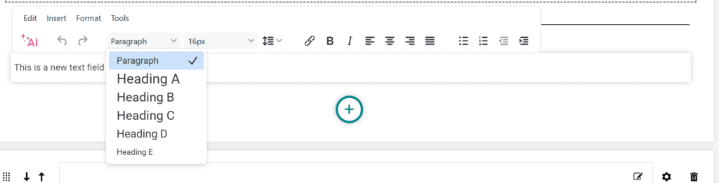
6. Create a Hierarchy
Instead of using paragraph (or header) for all your text and simply changing the size, use the built-in text options for headers and paragraphs. First, using the correct tags helps clarify the hierarchy of content for Google (and AI). Second, this also impacts the size of the text, signaling to people what the important pieces of information are.
7. Use Calendar Components
For events that are using TicketSignup’s Calendar-Based Timed Entry ticketing, use one (or more) of the built-in calendar components. These give your multi-day event a range of display options that are both visually appealing and functionally easy for ticket buyers to understand and navigate.
Bonus: Ensure Accessibility
One important note as you create your website: think about how different people will interact with your website, especially when it comes to anything you upload as an image (including your homepage banner).
- Check mobile-responsiveness. TicketSignup’s website components are built to be mobile-responsive. But if you upload an image with text on it, that text is not responsive. Make sure you check it on a screen to ensure all text is visible and readable on a mobile device.
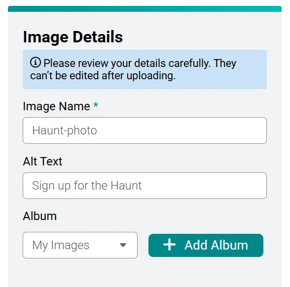
- Use Alt Text. It’s estimated that more than 7 million people in the US use screen readers to navigate websites. This means there are (many) people who won’t see your images. That’s fine if an image is merely decorative, but if your image serves a purpose or includes text, use the alt text field when you upload the image to provide a short description of the image (or the text on it).
Final Thoughts: Test it Out – and Get Inspired
It’s easy to make changes in the TicketSignup website builder. This means you’re never locked into a design. If you’re not sure what looks best, just start by picking a set of style settings and test out different component structures, fonts, and colors until you find what you like.
If you need inspiration to get you started, you’re in luck – TicketSignup customers have created a wide array of professional event websites, and you can browse a few of our favorites below!