
Over the last couple of months, we’ve added powerful Ticket Analytics to the ticket event dashboard. Currently these analytics are at the bottom of the dashboard below the quick cards and transaction charts. We will be moving new analytics to the top of your dashboard once we release new ticket sales summary statistics in the coming weeks.
There are 3 different analytics charts that give you more insights on your ticket sales, customers, and marketing:
- Tickets Sold: Track your ticket sales by ticket type. If your event is multiple days with timed entry, drill into sales per day and time slot.
- Heat Map: See where your attendees are from. This data helps you target locations with digital and physical marketing.
- Promotion: Dig into the success of your Referral Rewards program.

Tickets Sold
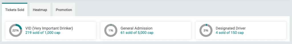
The Tickets Sold chart is customized based on your event’s set up. For example, this is a beer fest in 2023 with three ticket types that each have a cap. The chart enables easy tracking of sales and helps events modify caps in real time. For example, VIP tickets are selling much faster than general admission tickets; therefore, the event may want to consider increasing the caps for VIP and reducing the quantity of general admission tickets.
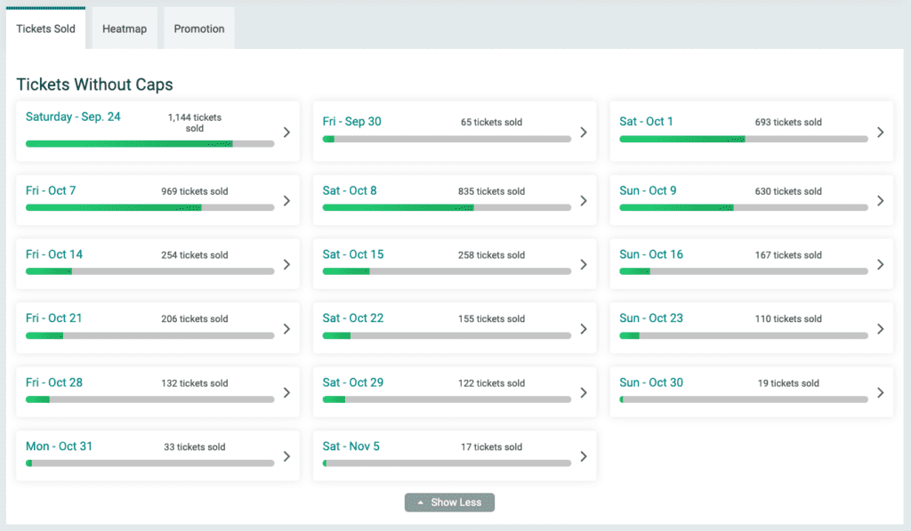
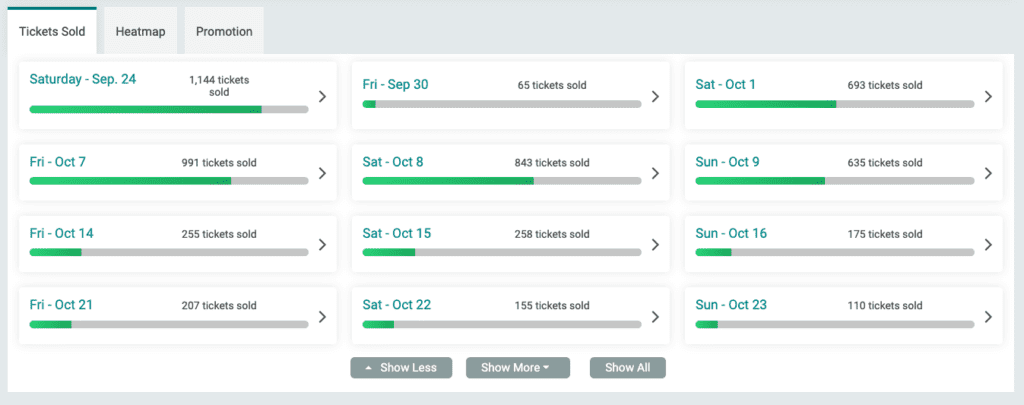
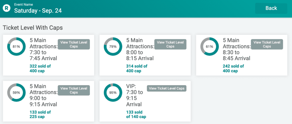
For a multi day event with timed entry, the main page shows the number of tickets sold per date.
Clicking into a specific date shows the tickets sold per time slot. In this example, there are caps for each time slot. Similar to the above example, this enables events to track in real time how close they are to capacity along with a quick link to update caps based on what’s happening on site (i.e. not crowded so increase the cap to let more people in).
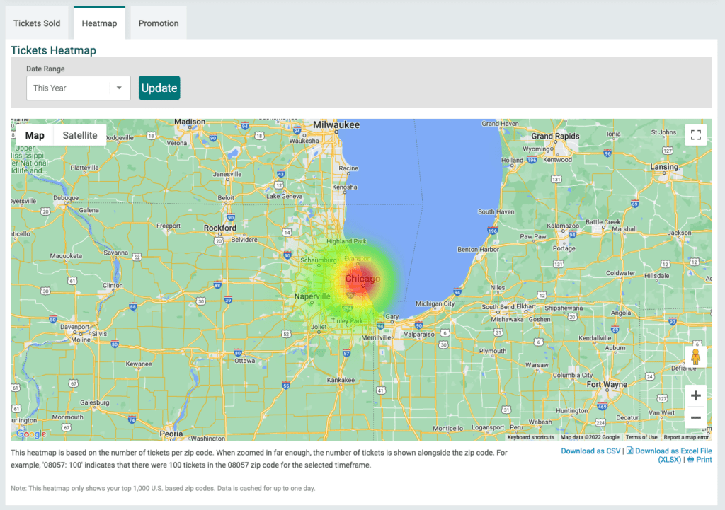
Heat Map
The heat map lets you see where your customers are located. While most events do not collect address from their ticket purchasers, we use the zip code from the credit card to generate this data. In the example below you can see most attendees are from the Chicago area.
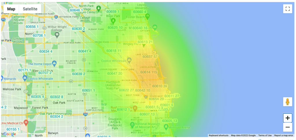
Zooming in we can see counts of tickets sold per zip code.
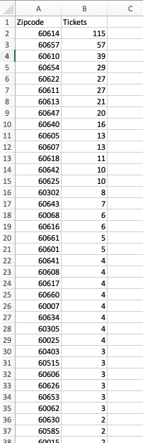
The export option generates a report that includes zip code and count of tickets sold. This enables your event to know where most of your customers are based for location targeting of online ads and good data on where you should spend your physical advertising dollars.
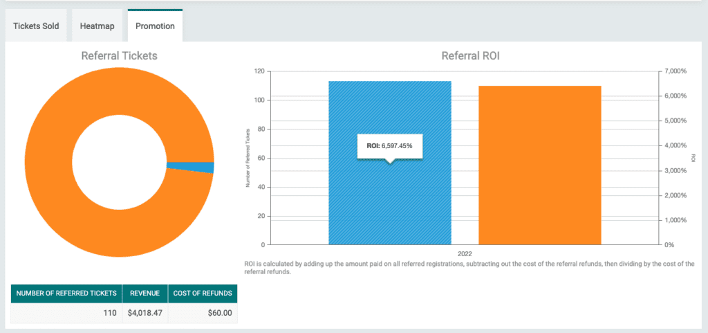
Promotion
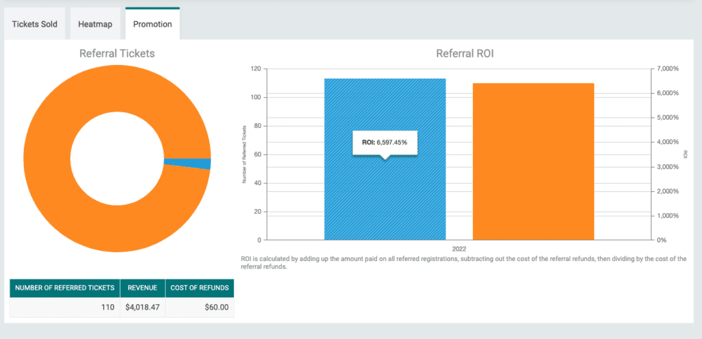
The third tab is only available to events that have enabled a Referral Rewards program. In the example below, the event has sold 110 tickets through their attendees’ unique referral links. This has resulted in over $4,000 of revenue for a cost of just $60 for refunds to the referrers who hit the referral threshold – that’s a CPA of $.54 and a 6,500% ROI! Referral Reward analytics show the power of Referral Rewards for ticket events and enable events to track their CPA and ROI versus other advertising spend.
With the release of the Attendee Quick Search, more Ticket Analytics, and the power to control your event with our easy-to-use ticketing software, your ticket event dashboard is becoming increasingly powerful. Next we will add website analytics that enable you to track page visits, the source of those page visits, and data on whether page visits convert to ticket sales and/or donations.